
Democratizing the information for the AP Students
More than 30 percent of the high school students take an AP course to get credits from college to save money and time, try new courses to find their passion, or challenge themselves to achieve higher.
Our goal for the project was to democratize the information and exam preparation training for the AP Students. As the AP team, we made major changes in 2019 and moved most of our operations to digital. With our new products and extended ecosystem, the system was democratized to equally serve 4 million students a year. We positioned the AP Student website as a key gateway to this service.

High-level Priorities
1
Prioritize the transactional actions with the support of informational content
2
Utilize the digital space to inform students about majors, careers, and colleges to students
3
Increase overall findability for key student tasks, and satisfaction rating
My Role
I played a generalist role on this project. I am still contributing to this site to improve and achieve better. My main focus was conducting quantitative and qualitative research, creating the new structure of the site, and UI design of the product.
During this time, I collaborated with a Researcher, a UX Designer, 2 Content Strategist, and a Product Manager.
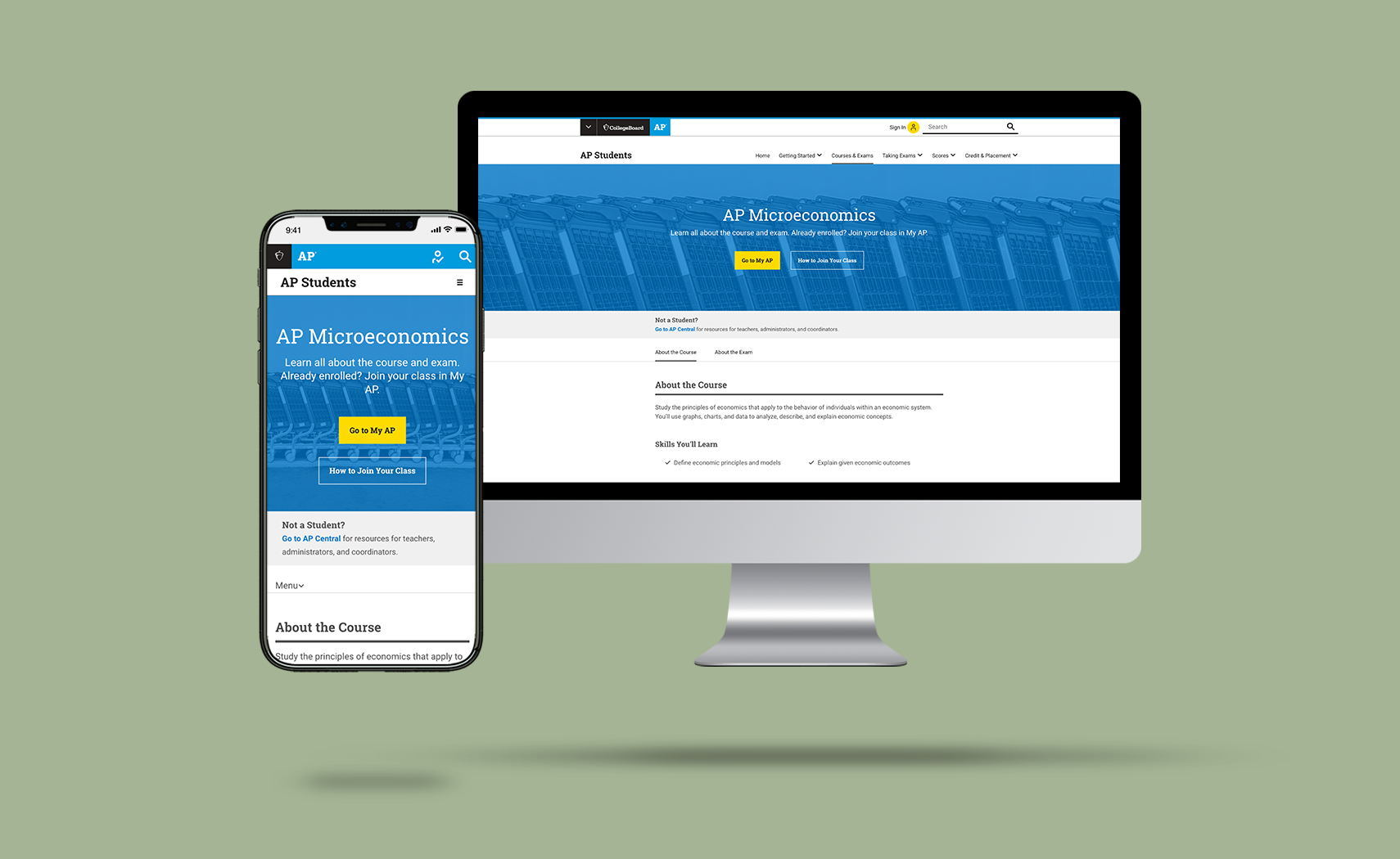
The site launched on May 21st, 2019.
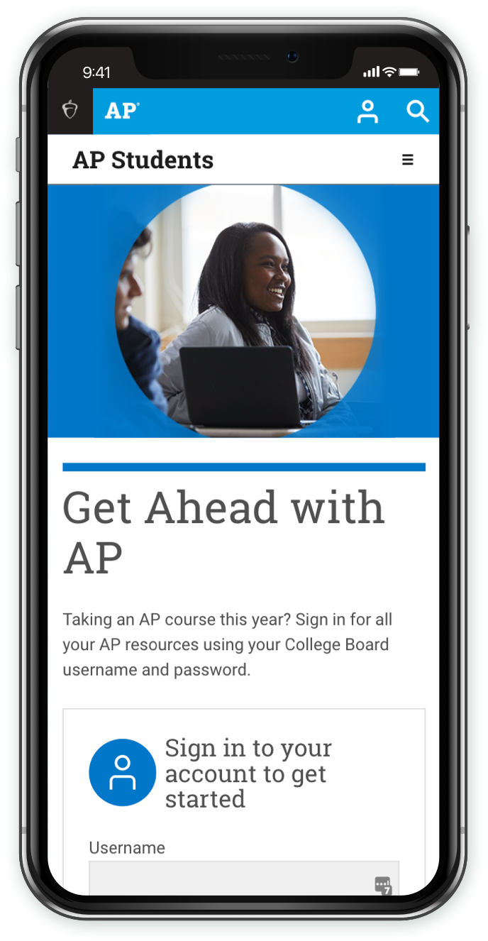
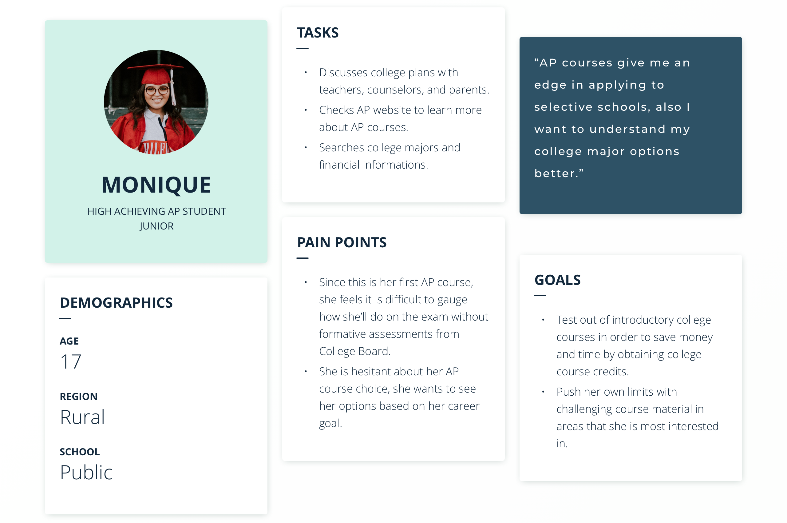
AP Students = High Achieving Students
In the AP Students site, there were multiple different groups of users such as students, their parents, and educators. Since it’s a student-focused website, we primarily served them. The number of unique student visits per year is around 4 million. They were divided into two user types, the primary users are the students who are already taking an AP course and the secondary is a student who will or considering taking an AP course. We peered up with our research and data team to understand the user behavior on the site as well as with our product owners to understand the business needs. At the end of our define phase, we had a better understanding of our primary users and their service needs.

User's Journey
Since the students’ needs are changing based on the season, we allocated time to understand the effect on students. The season was divided into three high levels such as; before school year preparation, during the year experience, and after exams/score release. As the next steps, the user’s journey map provided detailed insight into our service requirements.
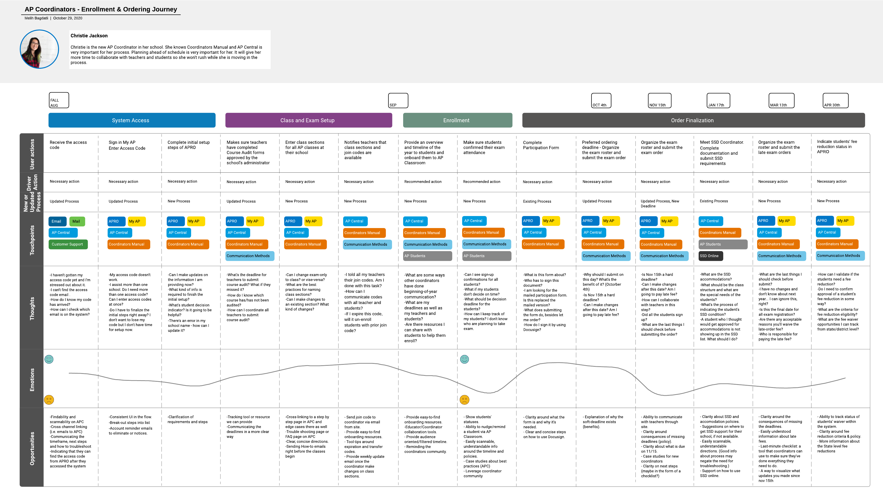

Here is an example of how the journey maps I prepare to look like.
Definition of Success
After understanding the business and user expectations from our service we set clear goals to keep the project’s focus on track. The team’s goals were as follows:
1
Improve the success rate of findability on the top 5 user needs and business needs
2
Increase the satisfaction rate of the users from 60% to above 75%
3
Help to increase account creation by 15%
Findability Improvements
One of the main problems of the previous AP Student site was the structure of the site. For students, finding the information was challenging because the site had years of clustered content and was obstructing their ease in searchability.
To understand our ideal structure, we mapped out the user/business needs catalog. During this time, the redundant or unrelated content from our structure was cleaned up too. The first site map and the map for the Treejack Tests were prepared to validate our approach.
Validation
Our main goal from the tests was to understand the distribution of our content. The top 5 user and business needs were tested by asking these questions to students and non-students. The test results were used to update our sitemap both structurally and editorially. With this approach, our sitemap was initiated faster to achieve better. As a result, the site navigation was improved to 20% better in the findability of the top 5 goals.
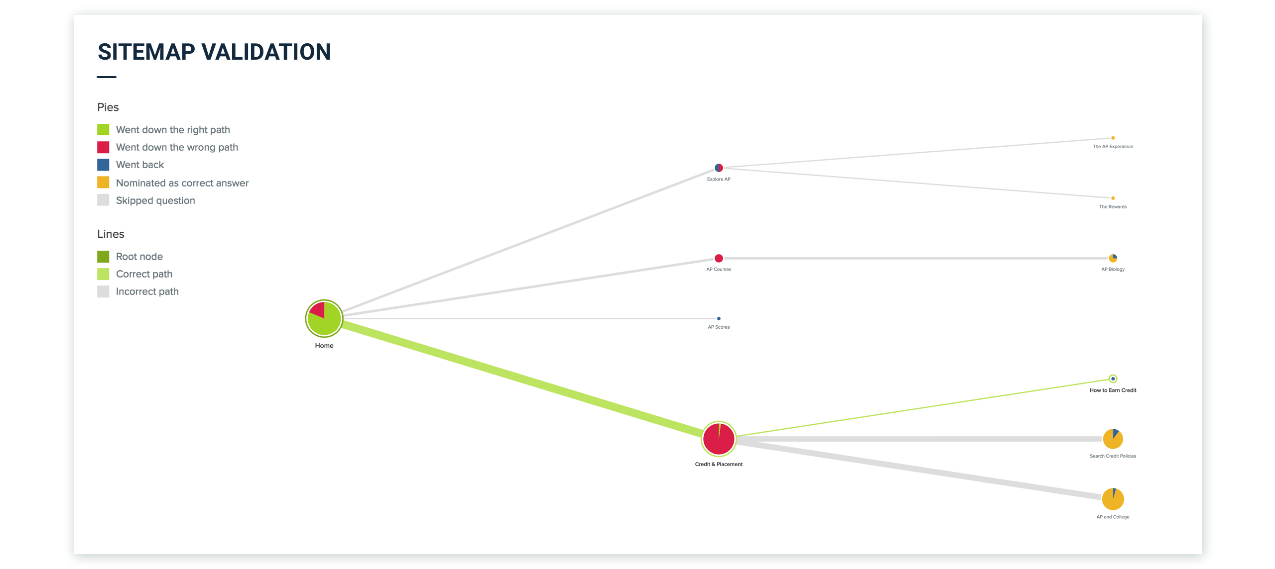

Treejack Test of one of our high priority flow
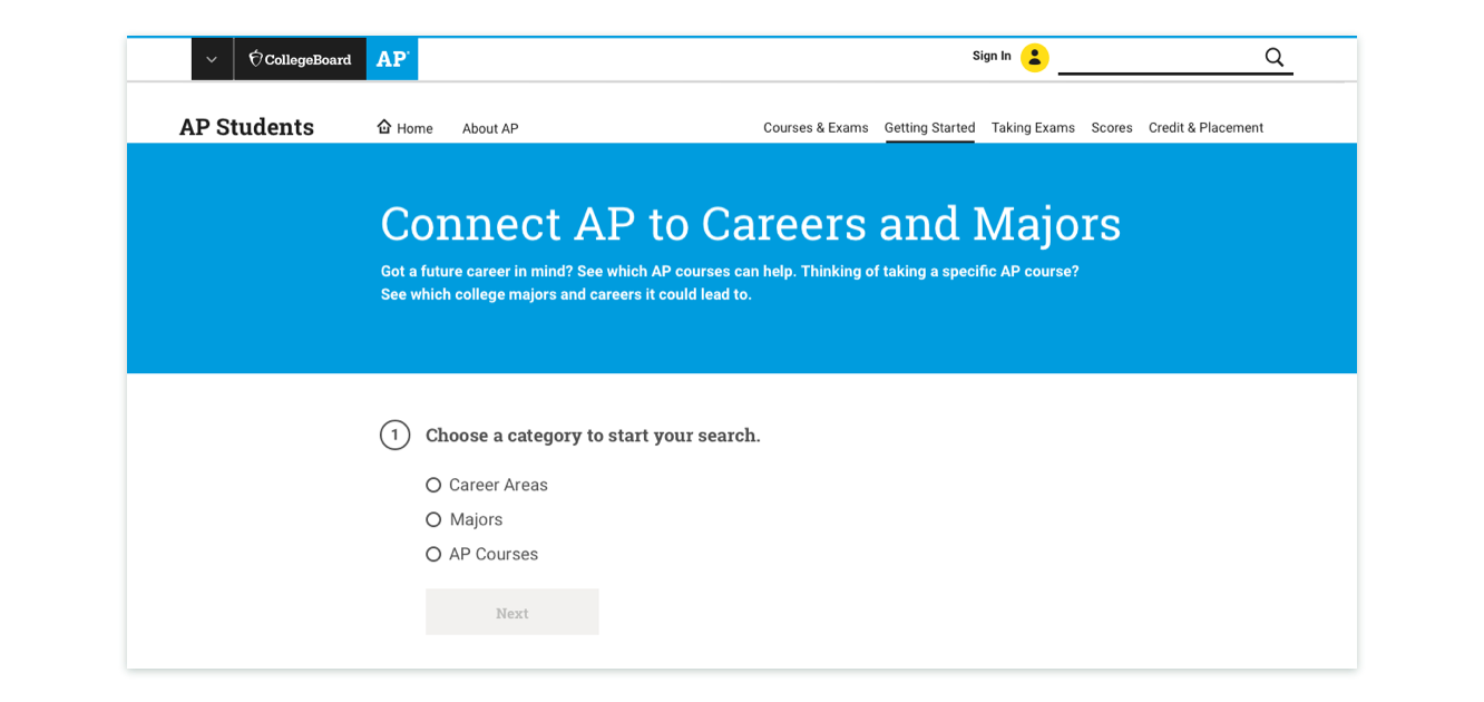
Majors and Careers Tool
Majors and Careers tool is an important piece of the AP Students site. This tool allows students to explore future opportunities by searching by the AP courses or by their interest area. However, the previous version of this tool wasn’t encouraging students to explore new major or career areas. The main problem was the page structure and the interaction points of the page. The search began by understanding the tool usage and feedback from our surveys. Then, the user needs became clear.
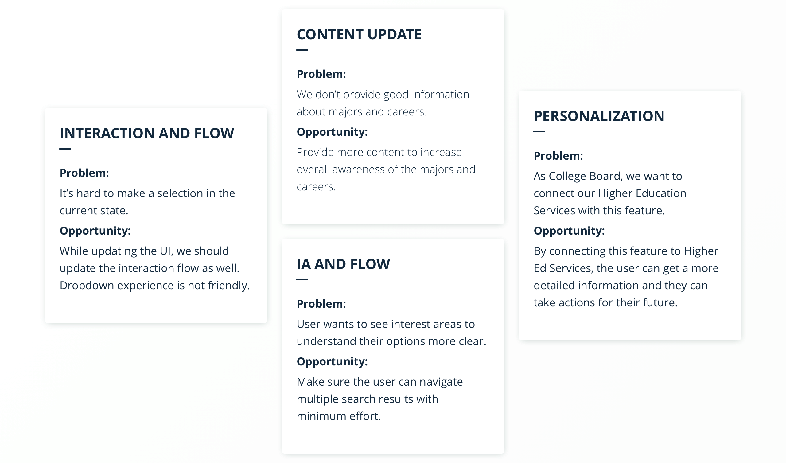

Problems on the previous design and opportunities to improve.
Ideation
Understanding problems and needs led us to look for possible opportunities and solutions. I led a couple of collaboration hours to share my findings with the team and collaborate on finding the possible solution ideas. After a couple of work sessions, the team proceeded with the feasible ideas.
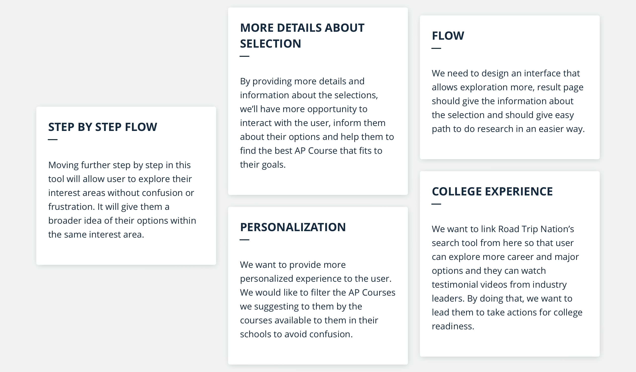

Design solution ideas that I gathered and presented to the team.
Design Steps
Since there was limited time to design and build the page, the team decided to move forward with internal team usability tests rather than testing the tool with real users. The team launched with our initial design, however, aligned to improve this page within 3 months after the site launch.

First Design of Majors Careers Tool
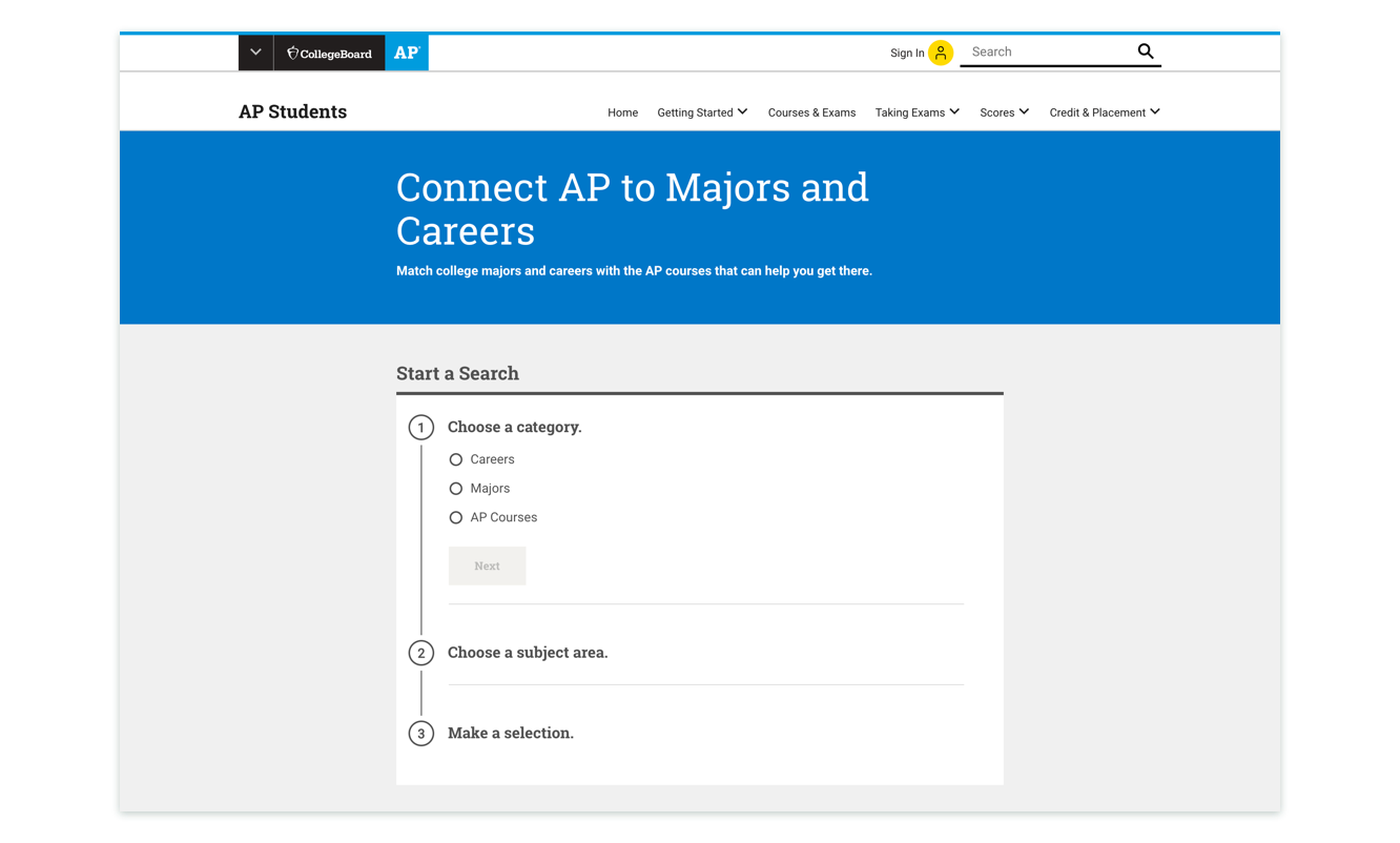

Final Design of Majors Careers Tool
The team was challenged to find ways to improve our design. As a result, user data was monitored. The qualitative and quantitative research gave us a sufficient understanding of the updates needed to make. I updated the design by using the feedback gathered. The additional time was utilized to run user tests on our designs to measure the designs’ success. After running 20 user tests, we determined the design updates for the next iteration.
The prototype of Majors Careers Tool
Success With Numbers
At the end of this round of iteration, I was able to provide a successful UI with meaningful interactions to the user. I simplified the interactions, as well as improved the content hierarchy based on the feedback gathered. As a result, the team improved the completion rate from 64% to 79% and increased the number of users who make new searches on different topics by 23%.
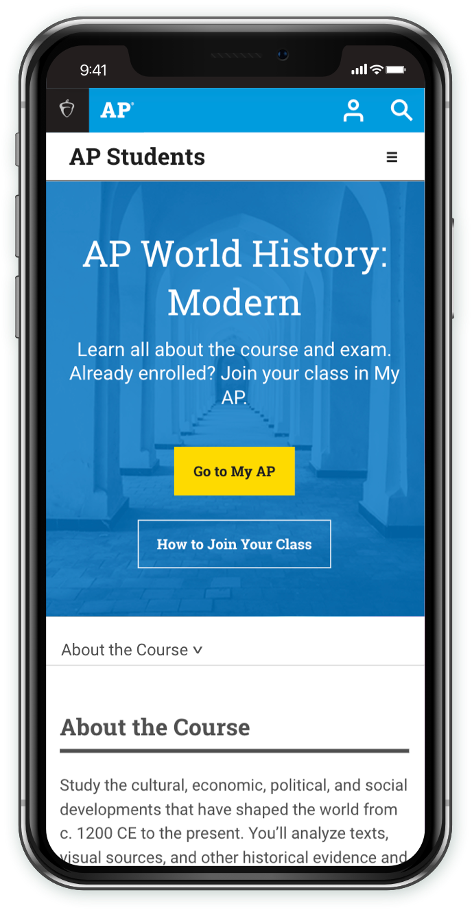
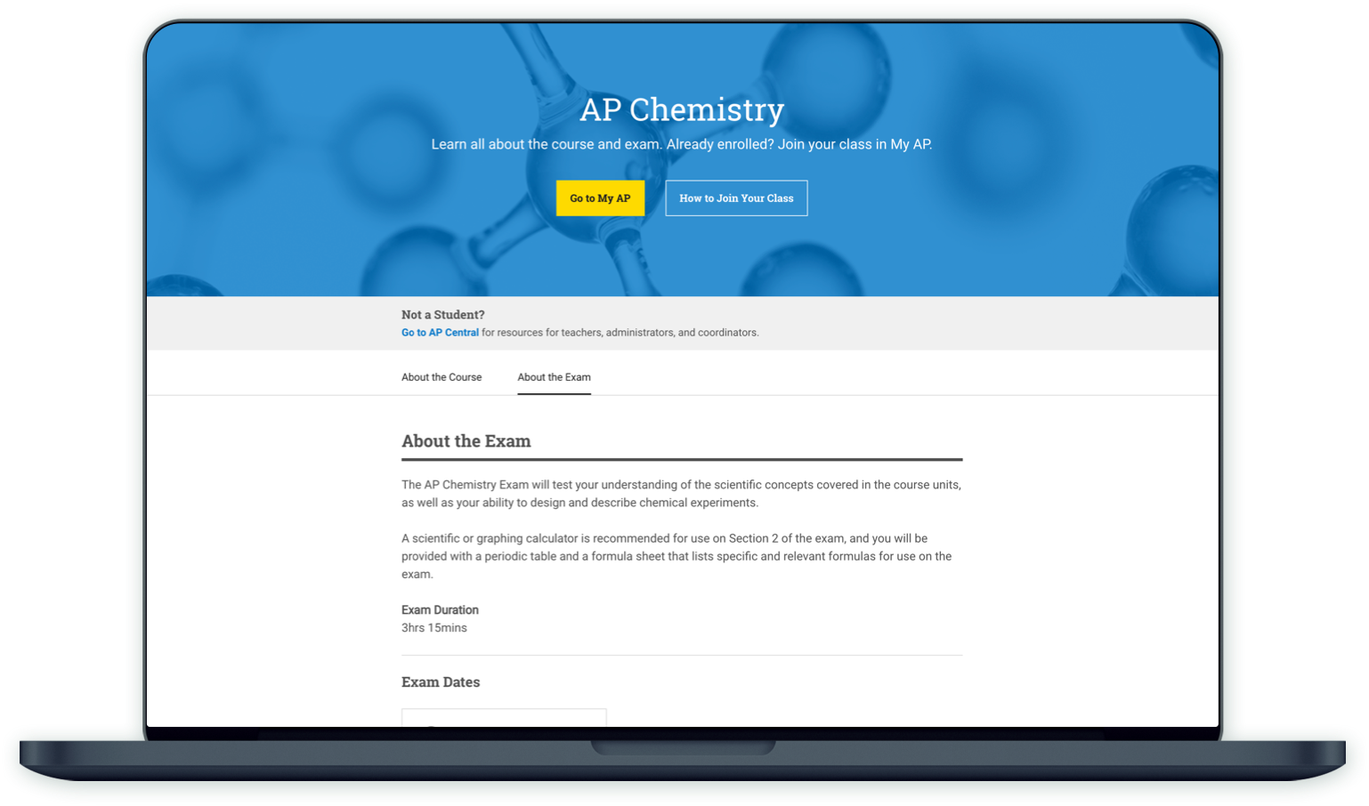
Course Page Designs
The course and exam pages’ are the top-visited pages in AP Students. Their main purpose is informing students about the courses/exams, upcoming events but also providing the resources to study and get ready for the exams. This is the reason, Course and Exam pages are highly important for the AP Program, students, educators, and parents. However, the challenge of the page’s design was to achieve high user retention with some technical and logical constraints.
Constraints of this page:
- 35+ different user needs within two pages
- 38 different course page needs to fit into one type of template
- Limited flexibility on the data feeding these pages
- Rigid design system
- Serving multiple user types within the same page

Designs
To address all the needs, the team built a list of the group needs based on their relations. The lists were used as time efficiency tools for the first design sketches in order to understand the content topics and iterate quickly. After a couple of rounds of feedback gathering from product owners and our development team, the final version fit well within the constraints of the design system.
The digital version of the design was iterated 2 times to achieve high-quality results. Within 2 rounds of tests, more than 20 students' feedback was gathered. Moving forward to future iterations, the team is still working on gathering more information about the usage of the pages to find or make improvements.

For more details, please check the AP Students’ website from here.


© Melih Bagdatli