ABOUT THE PROJECT
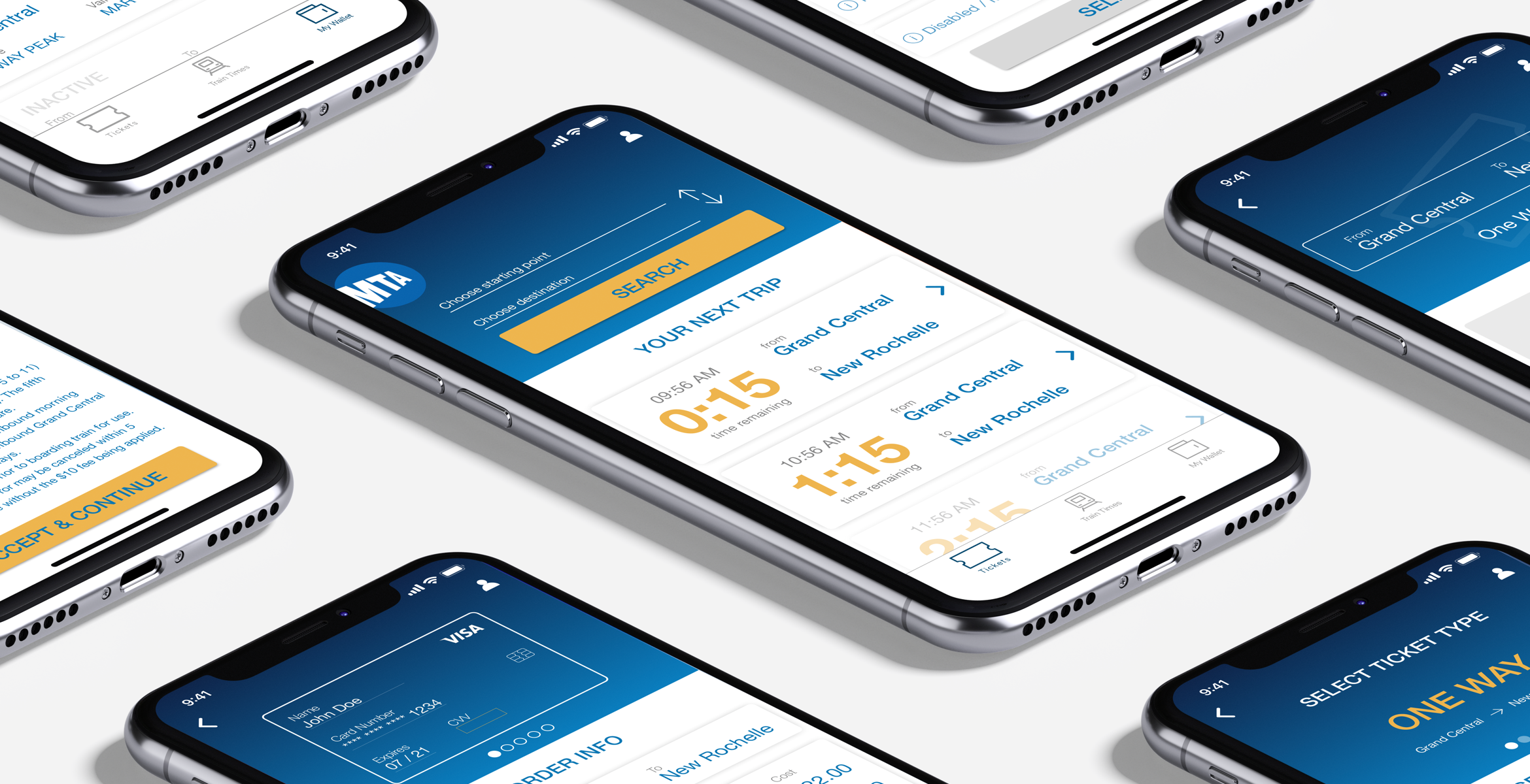
MTA E-tix is a mobile application that lets people purchase and uses Long Island Rail Road and Metro-North Railroad tickets directly on their mobile devices.
I have used this application a few times and found it frustrating and confusing, especially if I was in a rush. After bringing it up with my friends, I realized that I wasn't the only one feeling this way, so I decided to renovate the experience of the application by interviewing real users.
The goal of this project was to redesign the application in such a way that it will allow commuters a reliable and uncomplicated way to plan and purchase their trips through a user-friendly product that offers personalized features and makes their mobile experience quick and hassle-free while making their commute comfortable and smooth.
MY ROLE
Based on research and analysis, my partner and I have refined user journeys within the MTA application and improved information architecture as well as visual design to better accommodate a primary user group of busy everyday commuters and other customers.
My role for this project was conducting thorough research through competitive and comparative analysis of similar applications, in-depth customer interviews at Grand Central and a user journey map of the MTA customer experience. Based on the evidence, further feature analysis and a new app map we have created a new set of wireframes. We chose Principle to design an interactive prototype so we can include fun animations and interactions for the delight of our users.
UNDERSTANDING:
THE USER AND THE BUSINESS
Before we could even begin to think about design, we wanted to have a better understanding of the public transportation services around the world. To do so, we have conducted competitive and comparative research as well as heuristic evaluations for other government-based and private companies and tried to have a better grasp of the constraints of the industry.
To understand our user, based on our own experiences and research in the psychology of commuting we prepared an interview script. With that script, we conducted user interviews in Grand Central for two days using a guerrilla method by stopping people who are real commuters of the MTA and asking their permission to interview them. After approaching 150 people and conducting 30 interviews, we refined our data into three major problems for the commuters.
USER NEEDS
- Check out the train times in advance
- Favorite trip for easy purchase and train time tracking
- Needs location-based services for purchasing a ticket
"Should be favorite routes/destinations for easy purchase option." M.L., 34
PAIN POINTS
- Complicated ticket wallet
- Ticket options are confusing
- 2 applications for ticket purchasing and train timing
- Train schedule changes
"All the tickets are in the same wallet, off-peak and peak are in hard to find that way." N.N., 26
UNDERSTANDING:
THINKING OUT OF THE BOX
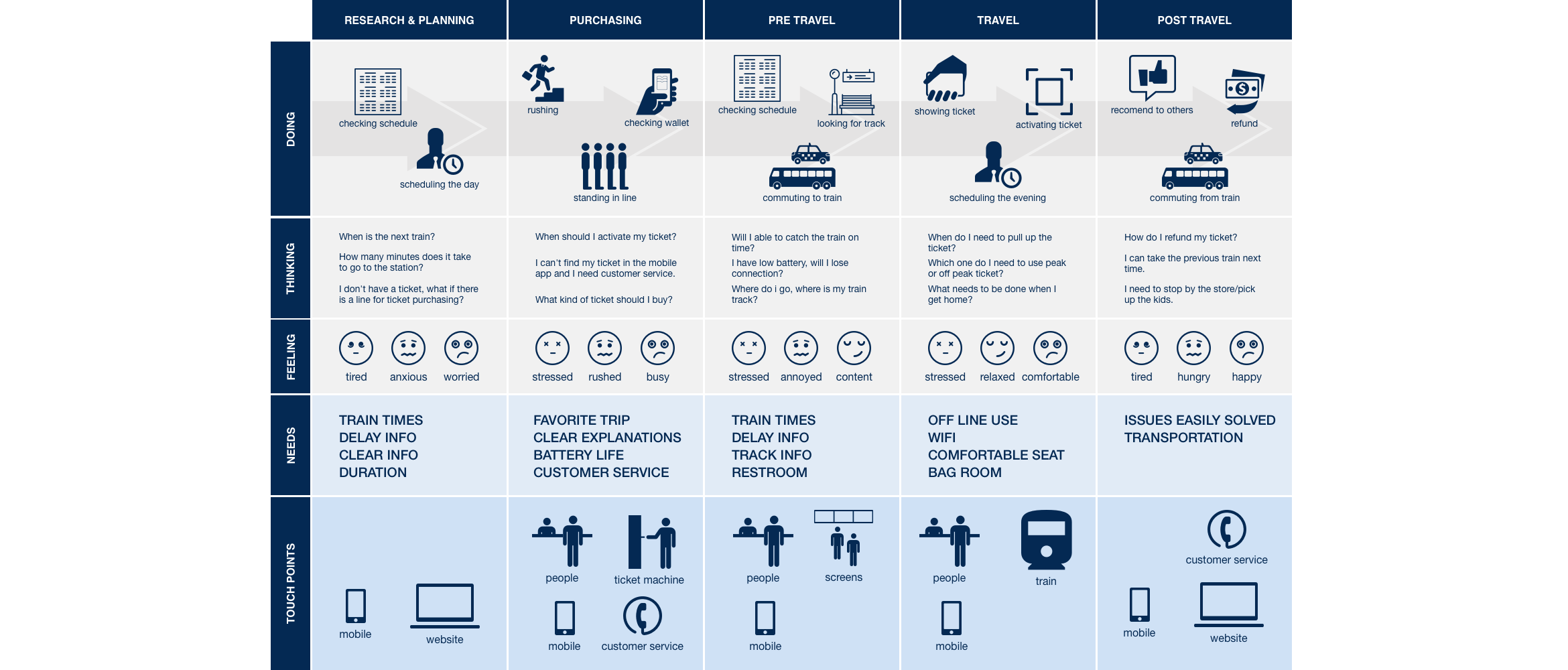
To understand our users even further, we prepared a detailed document with information on what people think, see, feel and do before during and after their commute. We really tried to get into their head and deeply empathize with the stressful moments of a commuter. We visualized this information into a customer journey map.
IDEATING:
MOST VIABLE PRODUCT
After organizing all research results and taking advantage of the Moscow method, we reached our viable product with the essential features. Based on our customer journey map and persona we had a better understanding of our users and how they would use this application to buy tickets and look up the train schedule which allowed us to create a user scenario. Combined with our findings from the Moscow method, user scenario led us to create an ideal path for an MTA e-tix app user. This design-thinking process led us to our next phase of creating wireframes.
DESIGNING:
STEP BY STEP
Once we had a foundation for the application in the form of an app map, we sketched out a rough version of the screens on the white wall. It is easy to improve and fix mistakes at that stage of the process rather than if designing straight to a digital medium. After performing user testings using the sketches, we decided to move forward with the medium and high fidelity wireframes. Once the layout and flow of the mobile application came together, we brought our minimalist UI designer side to the table and started creating a color scheme to our app and thinking about transitions between interactions.
DESIGNING:
AWAKING EMOTIONS WITH MICRO INTERACTIONS
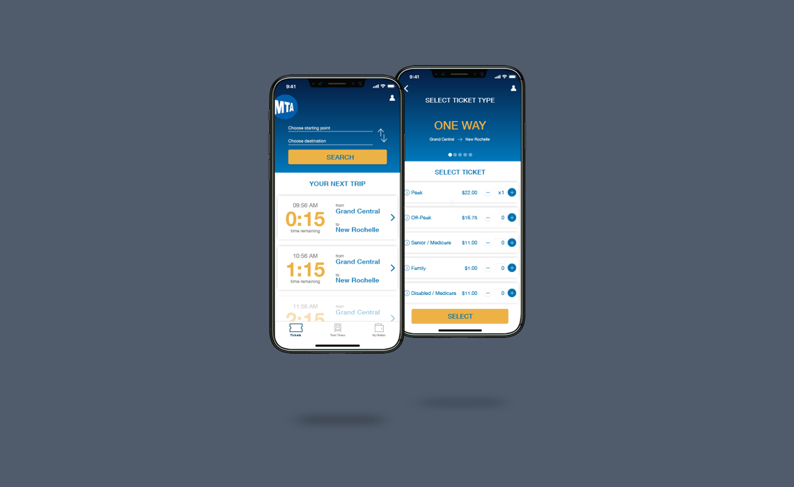
Working with Sofie was great because she has great empathy skills, and she always pushed us to give users a better experience by using new techniques. Since the industry is moving forward, micro-interactions have become a great way to truly charm a user when providing important feedback from an interface. Micro-interactions are animations that come along with an interface to make it more appealing and fun. We used Principle to create our final prototype for the MTA tickets application and it was an enlightening experience to practice using micro-interactions in this project.
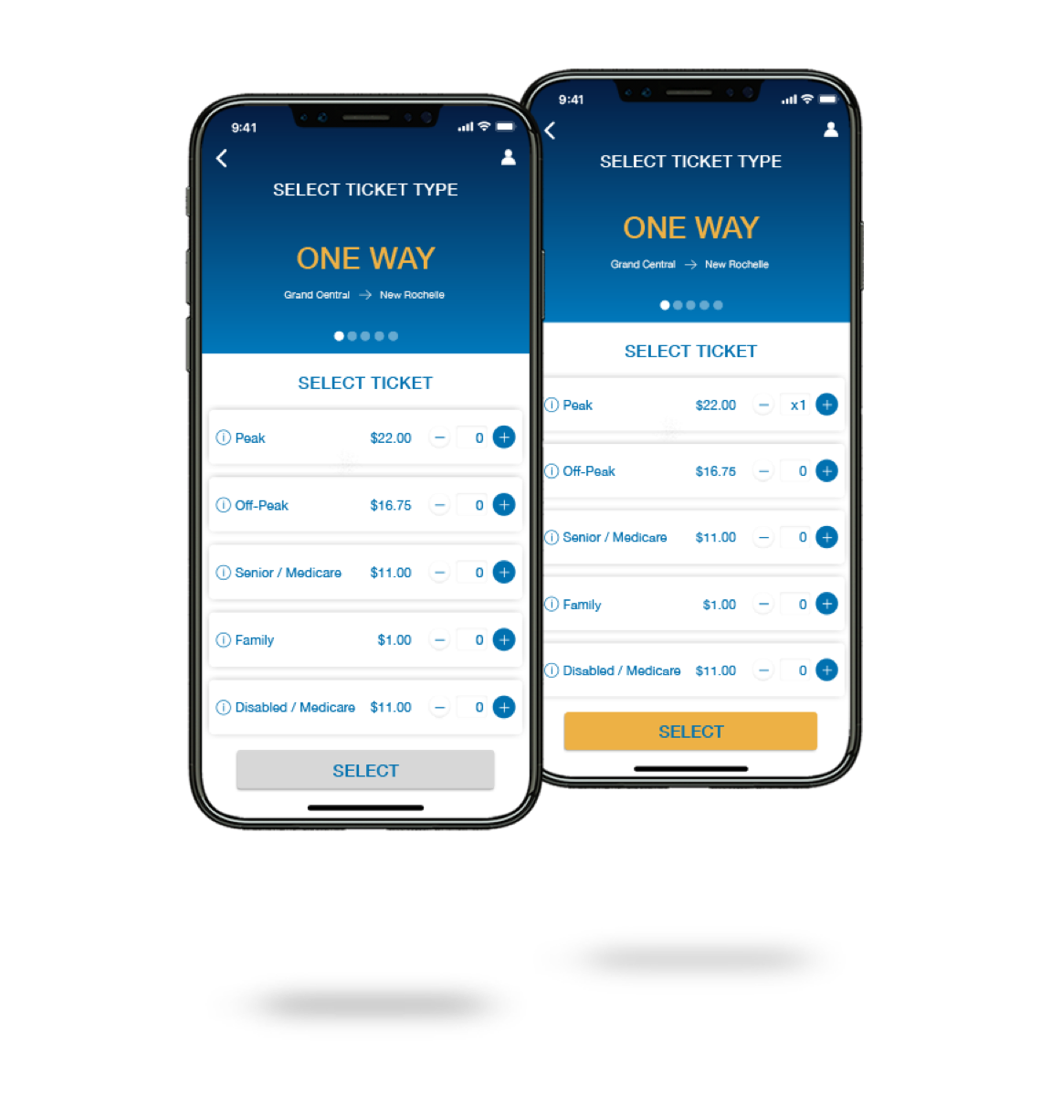
High Fidelity Mockups
CONCLUSION:
ONE STEP CLOSER
With this project, we wanted to solve the problem of purchasing and activating tickets effortlessly through an MTA ticket app. We tested our idea after completing every phase of the design by asking the users to perform the same task. This approach helped us to create a human-centered product because we used solid evidence to iterate our designs accordingly. The results are below.
- The time spending of checking the train time and buying a ticket decreased by 35%.
- The accomplish rate for finding the personalized route increased from 30% to 100%.
- The confusion between peak and off-peak tickets decreased from 70% to 30%.
