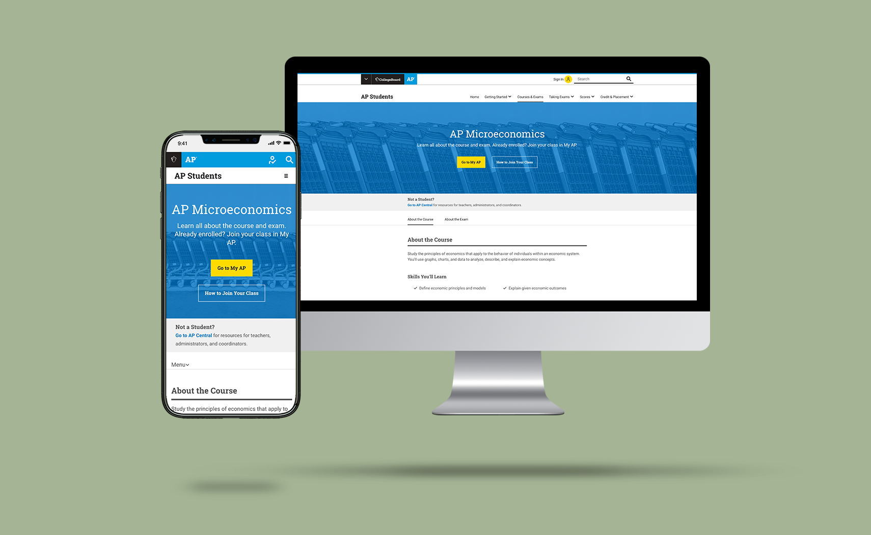
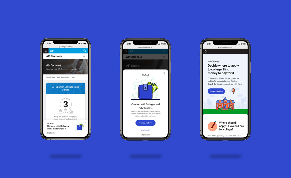
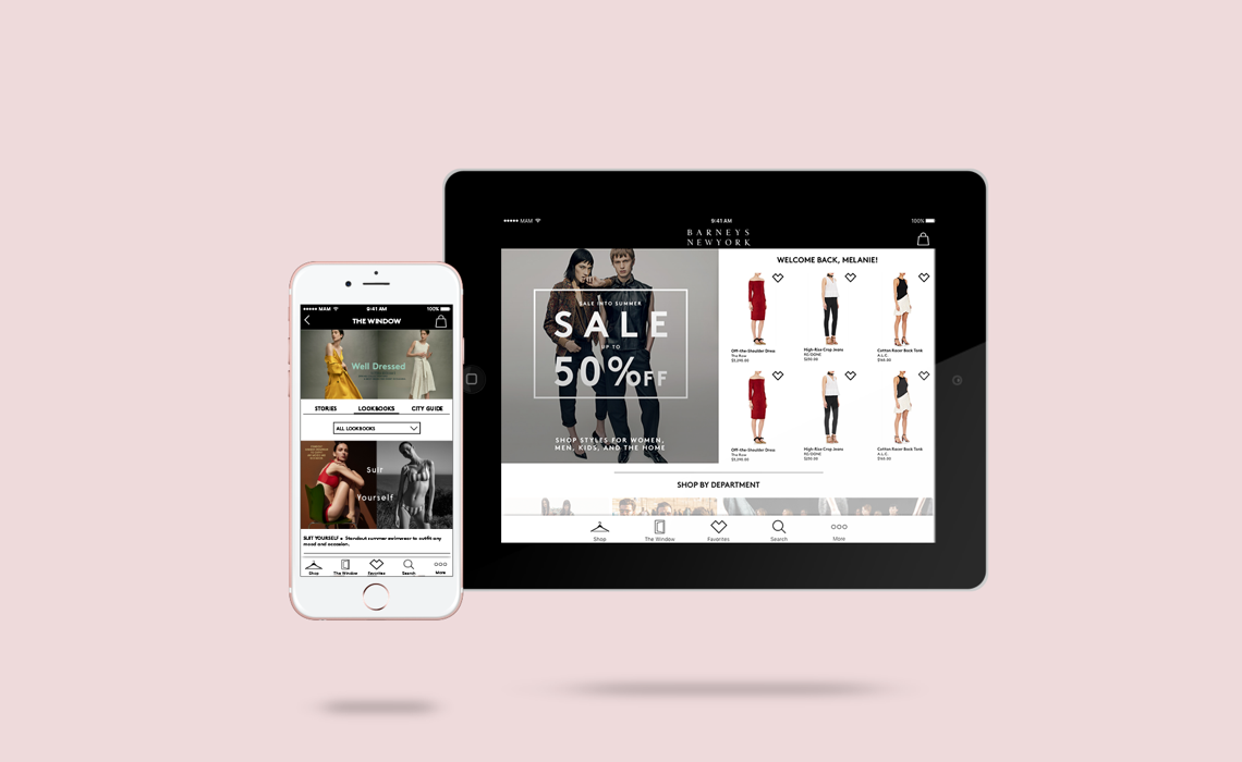
ABOUT THE PROJECT
When given the opportunity to design for Barneys New York, our mission was to provide excellent and more reliable service to the shoppers of the luxury brand. We envisioned an aesthetic and easy-to-use interface, and this was achieved through the design of the mobile and tablet applications of Barneys New York. Our team built the application from scratch, and we utilized Information Architecture and User Interface of the best quality.
MY ROLE
My team and I implemented a human-centered design approach to achieve the business goals of Barneys New York. This was accomplished through the research, ideation, and design of the company’s mobile and tablet applications. This streamlined approach enabled Barneys New York to achieve their vision of greater consumer interaction.


REFINING THE RESEARCH
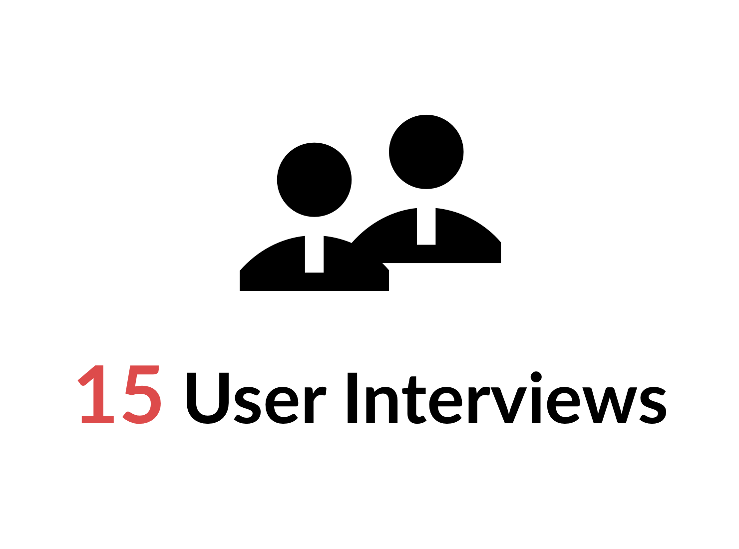
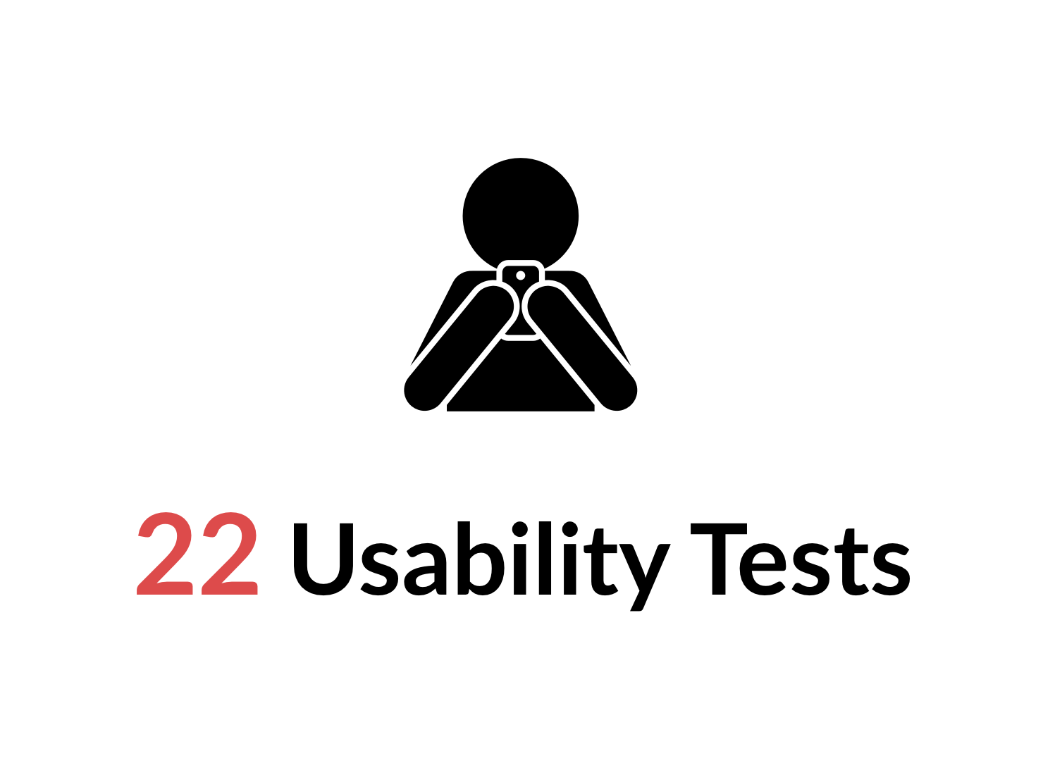
We were working on a three-week timeline, two of which were spent on the research process, which allowed us to obtain the best results. we had an extensive understanding of the brand, the users, and the market competitors. As a result of these steps, we had acquired an adequate amount of competitive and comparative analysis, contextual inquiries, user interviews, data analysis, and usability tests to create personas. These personas identified the needs and pain points of our users.
USER NEEDS
- Fast & Easy Checkout
- Curated Recommendations based on previous purchases and preferences
- Details on products and designers
- The ability to book in-store appointments
USER PAIN POINTS
- No Purchase History
- No Store Locator
- Product Assortments and Filtering Options

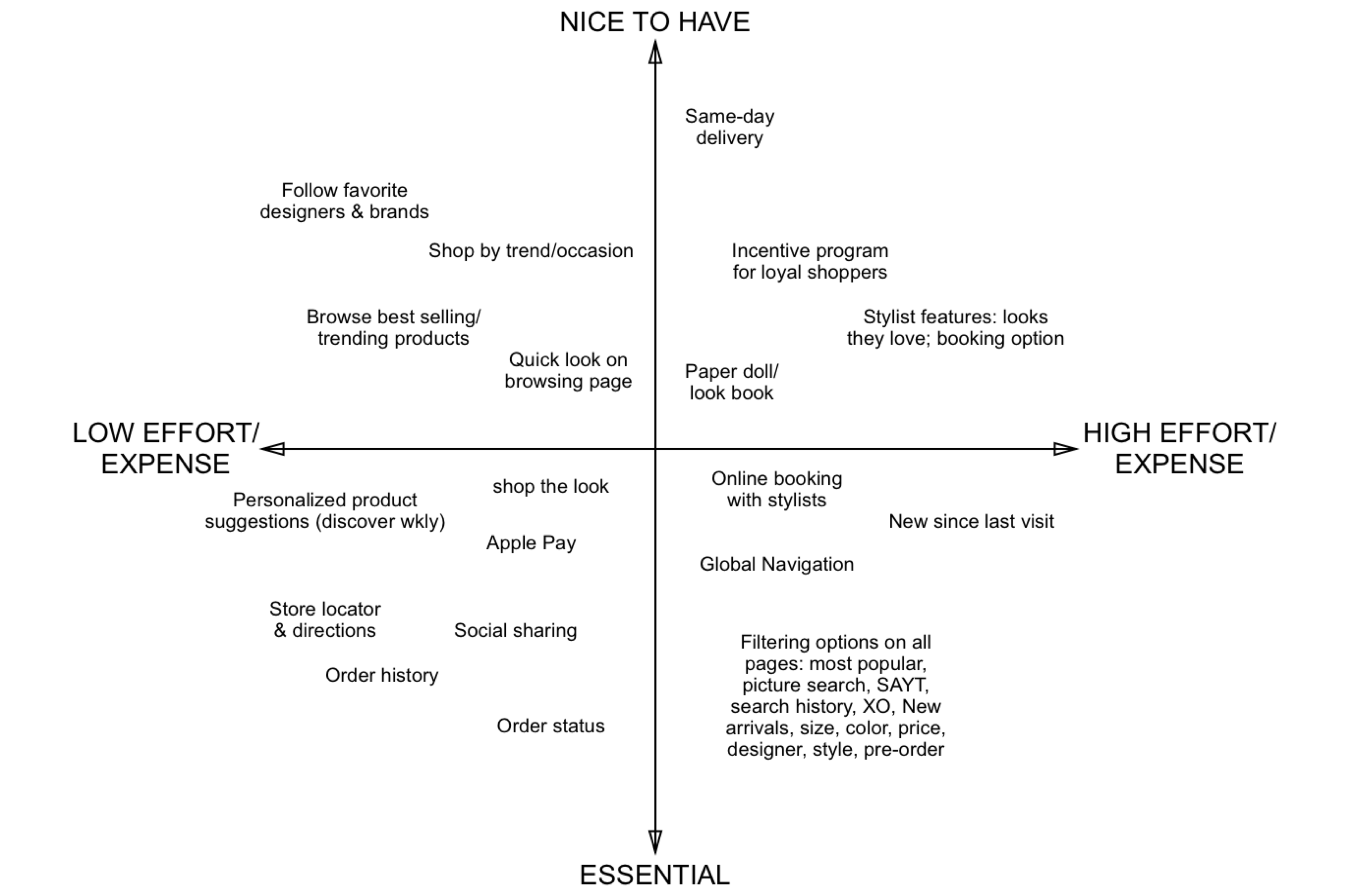
IDEATION
We combined our users' needs and pain points with Barneys New York's business goals. This enabled us to ideate concerning the features and structure of the mobile and tablet applications. After brainstorming feature ideas, we narrowed them down to those which would most benefit the company and user. The features were chosen based on time, budget, and necessity. The chosen features were utilized to create the Minimum Viable Product (MVP).

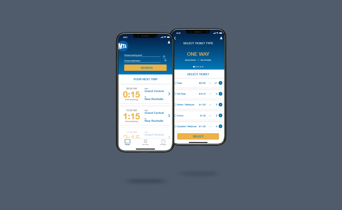
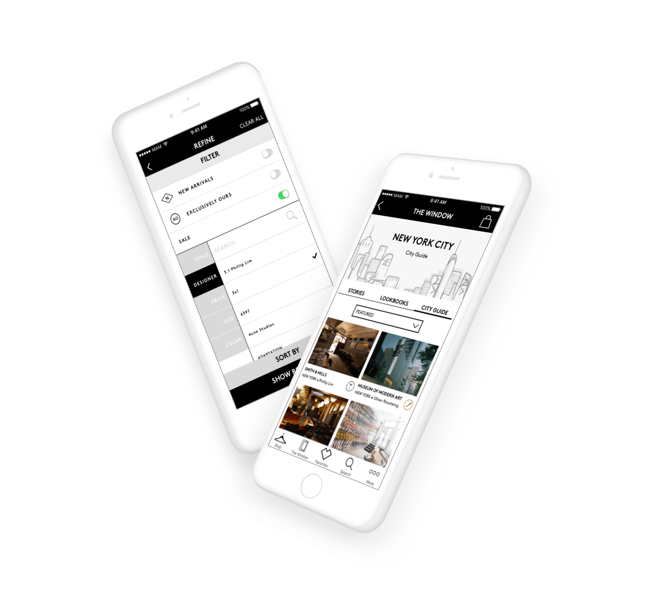
WIREFRAMING AND PROTOTYPING
The work from the previous steps gave the team the ability to create wireframes from low fidelity to high fidelity. We, also, build a prototype in every phase to examine our progress. Based on feedback and the results of user testings, we iterated the product. We avoided making changes to the visual design until the end of the project; this was to avoid wasting valuable time.
FINAL TESTING RESULTS
After completing the prototype, we requested for users to complete certain tasks. They would perform the same test each time we tested the prototype, and this would give us a clear picture of how the prototype performed over time. The results were undeniable.
- The accomplish rate for product browsing for a 'Little Black Dress' increased from 60% to 100%.
- Finding City Guide content success rate increased from 0% to 75%.


© Melih Bagdatli